ShareLink Day 2: Strategic Redesign for Long-Term Growth
Project Timeline: 2019
Lead UX Designer | Product Redesign and Strategic Vision
iOS | Android | MacOS | WindowsOS
Given a rare second chance, I transformed ShareLink from a feature-complete but struggling product into a scalable platform—applying lessons learned, prioritizing strategically, and building for Extron's long-term growth.
My Role
Led strategic redesign of ShareLink, applying lessons learned from Day 1 user research and market feedback to transform the product. Collaborated closely with engineering to rebuild both the user experience and underlying architecture for long-term scalability.
Business Opportunity
When engineering needed to rewrite ShareLink's core architecture, Extron had a rare opportunity to fundamentally rethink the product rather than just fix bugs. The Day 1 version struggled with market adoption due to usability issues, cluttered interface, and architecture that couldn't scale. This was a chance to get it right.
Impact At-A-Glance
✓ Delivered redesigned ShareLink on schedule (Q1 2021) with streamlined experience
✓ Built scalable architecture supporting 3+ years of planned features
✓ Reversed Day 1 decisions based on user evidence—embracing platform conventions
✓ Demonstrated design maturity: strategic iteration on own work
✓ Strengthened engineering-design collaboration through integrated redesign process

Perspective of a user testing the software. Once connected to a ShareLink device users can choose to share content to show on the large display in a room.
Strategic Challenge
Stakeholder Request: ”Fix the bugs and add the requested features from user feedback"
Reality
Three fundamental problems requiring redesign:
1. Architecture Couldn't Scale
Day 1 information architecture was too rigid to accommodate planned features. Adding new capabilities would create even more clutter.
2. Forced Uniformity Hurt Usability
Attempting identical visual appearance across iOS, Android, Windows, and Mac violated platform conventions, confusing users who expected native patterns.
3. Feature Clutter Buried Core Functionality
Trying to accommodate all audiences equally created an interface where no one could find what they needed. High-frequency tasks required too many steps.
Strategic Bet
Rather than incremental improvements, use the architectural rewrite as an opportunity to:
Subtract before adding: Streamline to essentials, then build from strong foundation
Embrace platform conventions: Reverse Day 1 uniformity decision based on evidence
Design for the next 3 years: Build flexible architecture, not just current features
This reframing positioned the redesign as strategic evolution, not just technical necessity.
Process, Decisions, Solutions
Process
Over 12 months, I led the strategic redesign of ShareLink, partnering closely with engineering to rebuild both UX and architecture simultaneously. Armed with usability test results and market feedback from Day 1, I conducted usability testing and card sorting to validate new approaches. This tighter design-engineering collaboration enabled us to make strategic tradeoffs between ideal UX and technical feasibility.
Activities
Usability Testing
Card Sorting: Information architecture validation
Engineering Collaboration: Integrated design-dev process
Day 1 Analysis: Research synthesis and lessons learned

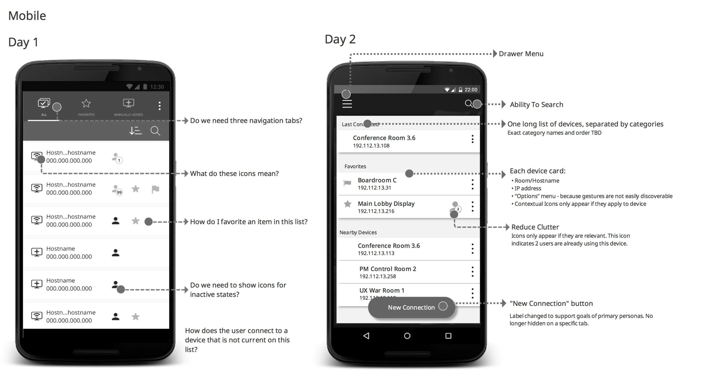
Day 1 Designs
Day 2 Designs
-
The Tension: Maintain Day 1's identical appearance everywhere vs. follow platform conventions
My Choice: Embrace platform-specific patterns—reverse Day 1 decision based on evidence
Impact: Users immediately understood interfaces because they matched platform expectations
Solution: Platform-Specific Designs
iOS follows Apple HIG patterns
Android follows Material Design
Windows/Mac follow desktop conventions
Maintained functional consistency across all platformsext goes here
-
The Tension: Add all requested features vs. remove unnecessary elements first
My Choice: Strategic subtraction—streamline to essentials before adding new capabilities
Impact: Cleaner interface made core sharing functionality discoverable and fast
Solution: Streamlined Information Architecture
Combined sharing controls with presentation view (single screen vs. multiple)
Removed elements that didn't resonate with users
Prioritized high-frequency tasks in primary navigation
-
The Tension: Ship improvements fast vs. invest in scalable architecture
My Choice: Build flexible architecture accommodating 3+ years of planned features
Impact: Created foundation enabling rapid feature additions without redesigns
Solution: Scalable Design System
Leveraged Extron's design system for consistency
Flexible component structure supporting new features
Clear patterns for future development team

Business Outcomes
✓ Launched ShareLink Day 2 on schedule (Q1 2021) with significantly improved user experience
✓ Built scalable architecture supporting 3+ years of planned feature development
✓ Established closer engineering-design collaboration model adopted for future projects
✓ Applied user research to reverse previous decisions—demonstrating evidence-based iteration
✓ Positioned ShareLink as competitive player in collaborative workspace market